Zahavy, T., Ben-Zrihem, N., & Mannor, S. (2016, June). Graying the black box: Understanding dqns. In International Conference on Machine Learning (pp. 1899-1908). PMLR.
My Objectives
To learn about an explainability technique for DQNs which I can use in my own project.
Paper Summary
The paper presents a technique to visualize activations of a DQN over a large state space using a high-dimensional visualization technique known as t-SNE. The paper augments t-SNE with additional state features like generation time, action taken, and other hand-crafted, domain-specific features. The authors use this visualization for DQNs trained in three different Atari game environments and present an analysis of the agent policy. The authors are able to identify a hierarchical policy and explain it qualitatively. They are also able to uncover unique features of the policy as well as states where the agent performs sub-optimally.
Methodology
The visualization technique is applicable to learning algorithms which produce Q-value estimates for each state. It involves collecting data from visited states during the evaluation of a trained agent. The data recorded includes the Q-value estimates, generation time, termination signal, reward and played action. Also collected are hand-crafted features specific to each domain, such as player position, enemy position, number of lives etc.
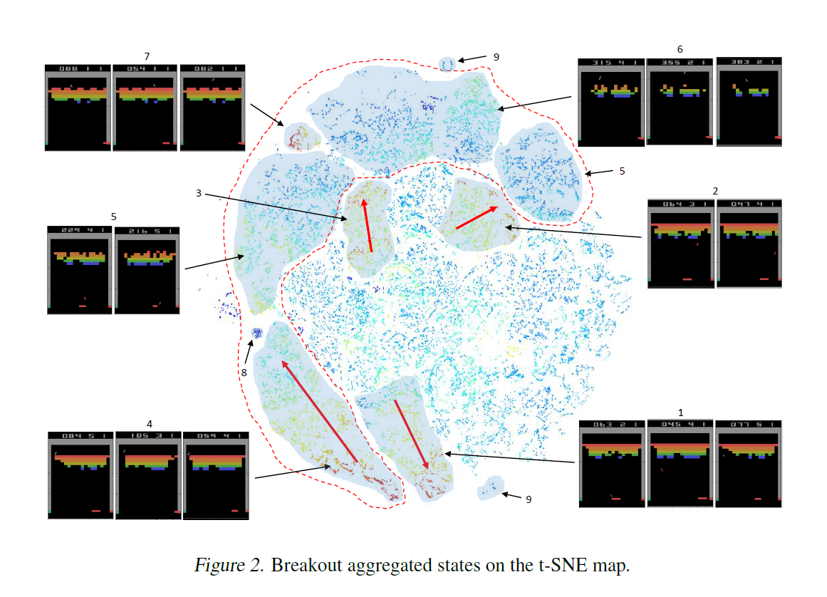
This state data is visualized using t-SNE to form a 3-D map. t-SNE is a non-linear dimensionality reduction method used mostly for visualizing high dimensional data. The points are coloured using a heat map based on the Q-value estimates. The points are clustered based on their identification as options - state space clusters which have a clear set of states serving as entry points, and terminal states. These represent sub-goals which are learned by the agent as part of its policy. Arrows are drawn from the entry to terminal states of a cluster. An example of this visualization from the paper for the Atari game Breakout is shown below.

This visualization is presented in a GUI. Each point can be selected to display the state and a the feature values for it. Also shown is a saliency map which is the Jacobian of the network w.r.t. the input. It is used to display the pixels of the image which affect the Q-value prediction the most.
The paper does not describe a structured way to carry out analysis in order to uncover insights into the agent policy, or perhaps to identify undesirable or sub-optimal behaviour.
Experimental Setup
The authors train a DQN agent for the Atari games Breakout, Seaquest and Pacman and obtain visualizations for each. The authors describe the hand-crafted features used for each environment. The authors manually analyse each visualization to provide identified insights into the agent policy and describe unusual behaviours.
Results and Analysis
For all three environments, the authors are able to use the identified clusters and the states they represent to present a hierarchical description of the agent policy. In Breakout, they identify a set of states where the agent exploits a bug in the emulator. Using the heat map colouring based on time (i.e., how late in the trajectory it was reached), they identify a drawback of the policy where it performs sub-optimally in states with few remaining bricks.
For Seaquest and Pacman, the authors are able to provide a detailed policy description and also qualitatively describe which state features affect the Q-value estimates.
The authors raise the question that the way the DQN learning algorithm handles initial and terminal states might not be optimal for learning the best policy. They show from their visualization that while terminal states are mapped to a single zone, initial states are also mapped to a single zone with wrong Q-value estimates. They claim that this suggests the DQN way is sub-optimal and recommend investigating other ways to handle initial states during inference.
Since the authors also display saliency maps for each state, they observe qualitatively that the score pixels (i.e., the pixels in the game which represent the score) usually have high saliency and affect the agent’s policy, causing it to be sub-optimal. They propose masking the score values when training the agent as a way to obtain better policies.
Discussion
The authors conclude with ways to use the hierarchical understanding of an agent policy. They describe ways to distil it into a simpler architecture. They claim that understanding agent policies can suggest ways to debug its behaviour and help design better algorithms which counteract sub-optimal policies.
Impressions
This is an interesting paper. A key weakness for me was failing to describe how these clusters were identified, since they play an important part in hierarchically describing the agent policy.
Additionally, there was no discussion on the appropriate choice of features to be used in order to get a useful clustering. This is probably a black art. It seems to me that authors who use hand-crafted features are almost embarrassed of it, and do not talk about it much. I believe that discussing the best practices for feature design, ways to identify good and bad features and the time taken to engineer them would be very valuable. I’m not opposed to using hand-crafted features but knowing how difficult they are to implement is essential if I want to use your proposed technique in a new domain. Madumal et. al. (2019) and Hayes and Shah (2017) both use hand-crafted features without any discussion on how to select or design them.
I believe this visualization technique represents an important step into building a data science of ML models, a set of tools and techniques to visualize and interpret ML models to gain insight into their behaviour and (in the case of RL agents) policies. I am curious as to how well it can be applied to non-game domains, and how much training/expertise is required to analyse the visualizations produced by this technique.